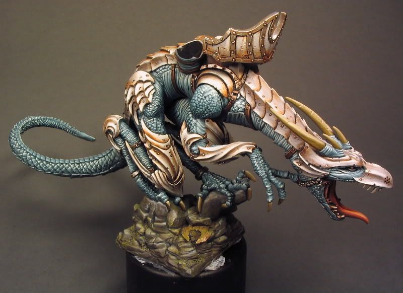
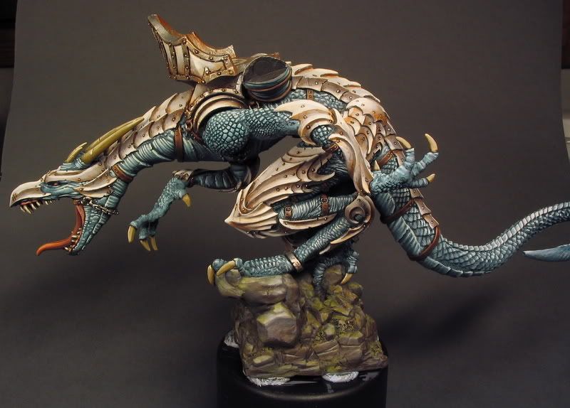
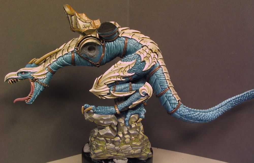
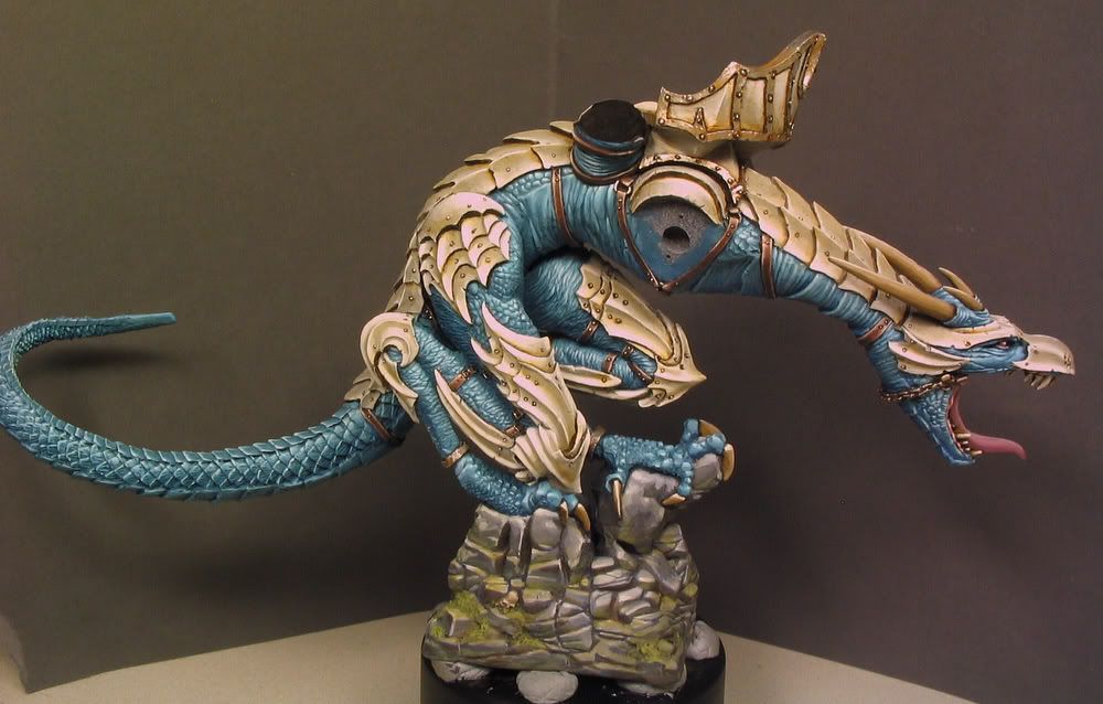
I think I'm going to incorporate more WIP material of the stuff I'm painting. This is a part of a commission project I've been working for a quite some time now. Yes, it's another dragon from Ultraforge and YES, the scheme may look familiar but it actually differs evidently from the one I did before. This time I'm using much richer and varying blue/turqoise tones on the skin/scales and I'm painting the armour plates with subtle yellowish offwhite tones to prevent the unsuccesful NMM look that may occur if too strong contrast are being used (i.e. too dark basecoat) beetween the shadow and light.
I first cleaned an old vallejo bottle and used it to lay down a good tone for the basecoat of the skin/scales. Last time I didn't do it and I had to mix the colour again everytime I moved to paint a new part of the figure. I created the basecoat colour by mixing several blue tones from VMC range (Light turqoise, Blue green, Pastel blue, Deep sky blue, Green sky, Dark sea blue, Dark prussian blue, Oxford blue...) to the empty bottle until I were satisfied with the tone. I have no recordings for the measures of different tones in the mix and I admit that the mixture is ver close to lightened Dark sea blue with less grey and stronger blue/truqoise tone. The more important thing is what paints are added to the basecoat to mix the paint for the lighter layers. I used Deep sky blue and also small amounts of pastel blue to build up the light reflection on scales/wrinkles. It's also important to have the shadows/non-reflecting surfaces on the lightest areas painted with lighter basecoat than the deepest shadows below the limbs. When I painted the basecoat I mixed it with different amounts of Dark prussian blue (which I planned to use for glazing the darkest shadows later) and painted the first actual layers with the pure basecoat tone. When I paint the first couple layers it's important to let the paint flow to the recesses of scales and wrinkles in the areas where the last brightest layers will be located. It's kind of sketchy layering phase with no need pay great amount of attention to the surface texture & details. When I start to add Offwhite to the mix (when it's almost pure Deep sky blue) I am already paying a lot of attention to the brush control and detailed painting, it's kind of stp by step process and the last dots of almost pure Offwhite I stipple with my best (and only) detail brush (which is currently W&N series 7 miniature size 2). In the pics you can see how the gleam of the scales looks more convincing in some parts than it does in others... this happens when the tonal change beetween semi light and lightest tones is not fast enough or the semi light areas are too big It's very challenging to execute perfectly as you have to always estimate the optimal size and lightness & location of the layers from start to finish.. the smoothness beetween layers is also important but not the main target for me.
I used two colours to mix the basecoat for the armour; VMC Light grey and Orange ochre. This time the mix is simple and the measures are pointless just not too yellow and not too grey that's how I see it. When I have layered the armour to pure white I paint thin glazes of Orange ochre to the shadow areas mainly. My attitude towards darklining changes repeatedly and it heavily depends on the case I often think that the contrast beetween colours & natural shadows (and perhaps light darklining..) are enough to stay away from this unintentionally comical (in a bad way) technique. In this case the thin dark lining separating the armour plates and rivets is necessary to achieve the right look and to enhance the power of the subtle colours used on the armour surfaces. I paint some of the lining before the layering just to lessen the percentual possibility of screwing up. I use thinned mixes of VMC Dark brown and Brown glaze for this lining I change the measures depending on how dark the lining need to be, for example I found that the best looking way to line out the rivets is to have more Brown glaze in the mix because too strong contrast in little detail points like those can look odd on a light surface.
Sorry for all the bad English grammar etc. got a spare hour for a little write-up... weird :)
..and the pics (the white parts are a bit over-exposured)
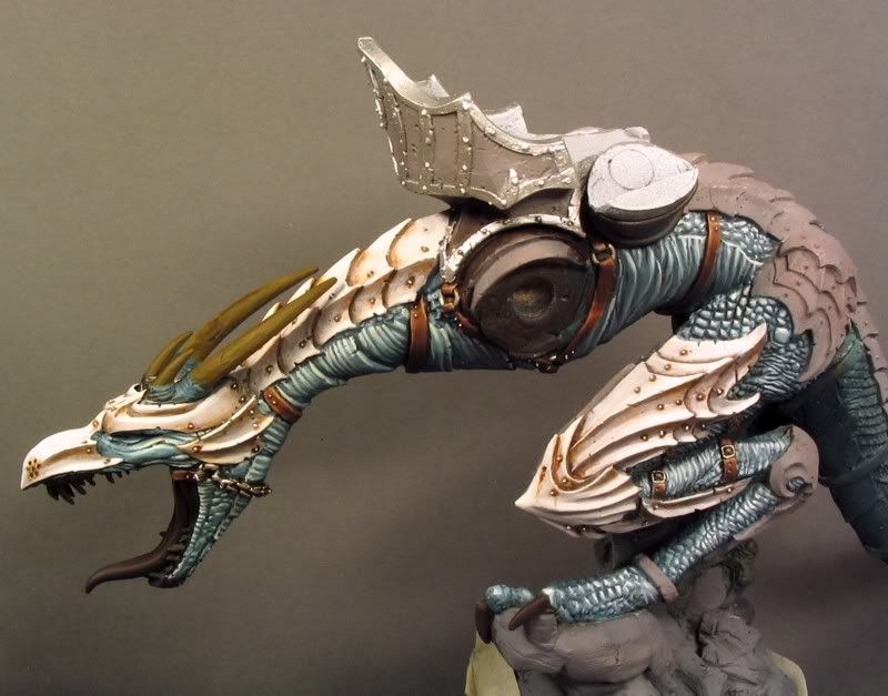
Here are some work in progress pics of the one I painted a year ago.