Thursday, December 10, 2009

Pretty little lightning paw

This is a new mini I recently painted for Pulp City. Her name is Kitty Cheshire and she will be soon accompanied with the Vector. The sculpture is masterfully created by James van Schaik and based on a concept by Melvin de Voor from whom I received some great advice.


Here is something completely different; some birds for the cat to chase (or the other way around..) Well they are not very villainous looking but who knows. They are two peacocks and a peahen produced by a small Alaska based company Forge of Ice and sculpted by legendary Sandra Garrity.


...and more cats ^___^

Wednesday, December 2, 2009

Microphones in the trees pt. 2


I have translated the walkthrough I made about making the base for the Defiance -diorama. There's not much text just a short description for each picture but more WIP pics than I normally have. I hope it's of some use.


After I had cleaned the parts I decided that I’ll paint the Cutter in these five parts. Here all parts are pinned and fitted.


After trying to arrange the miniatures to areas of different sizes I decided that a 6cm x 12cm rectangle would be good proportion for the base. I cut the basic structure of the base from sturdy five millimeter thick foamcore.


Then I cut the stairs from two millimeter thick corkboard.


At first there were six steps and each was 5mm broad but it looked a bit too steep and high.


I removed every other step which lowered the stairs and made them look better. I also shortened the wall slightly and covered it with thin plasticard. The stone paving was cut from a textured plastic sheet which was then scratched and sanded to make it look battered.


The wall was still detached when I applied the texture. I used Vallejo sandy paste as I’ve found that it works well for nice plaster-like texture. The stairs were supposed to look like concrete so I added smoother coats of the same stuff to have a clear difference beetween the materials. I made the electronic/wire-thing on the wall from plastic rod and plastic strips of varied thickness and shapes.


Then I added some holders made from plastic-tube and -strip to the wire. After this I finally glued the wall to it’s place. All the gaps were filled with standard Milliput and I also used it to create areas of dirt and some squished chewing gums.


I tested the composition of the minis with blu-tack and drilled the holes for the pins to the right places.


The last thing left before the painting was to cover the edges I did this by cutting the exact shapes from thin plasticard. I filled the corner gaps with Magic sculp.


Here is the final result.


When starting the painting stage I’m used to glueing long wires to the pinning holes of the miniatures and then sticking them to bottle cork. After they are painted I can just cut the wire to the right length and glue the miniatures/parts to their right place. Here are the miniature and the base primed with black and then lightly with white.


Here is the final sketch I made for the graffiti. I wanted to use real spray paint so I made a simple stencils based on the drawing. The stencil in this picture is primed white and then the parts that should be left white are covered with separate stencils and sprayed with orange.


First I painted the whole base with flat greys and I created the variation beetween the basic tones by mixing some blue and brown colours with greys. I used the glazing technique to paint the subtle tones of browns. The wall was only basecoated when I sprayed the base colours of the graffiti. The darker and lighter tones of the orange parts were painted with glazes.


I did not want the graffiti to look too bright so started to glaze the whole wall with brown and grey tones. After this stage I ended up to fade the graffiti a lot more.


Here are the few more pics I took of the painting stage.


Here all the miniatures are attached I still had to fix couple things before taking the final pics. Adding more glazes to the graffiti was the most notable of them.

Tuesday, November 24, 2009

Set fire to flames

I have just finished a big commssion project and it's time for
An Epic blog post (in my very own scale that is).


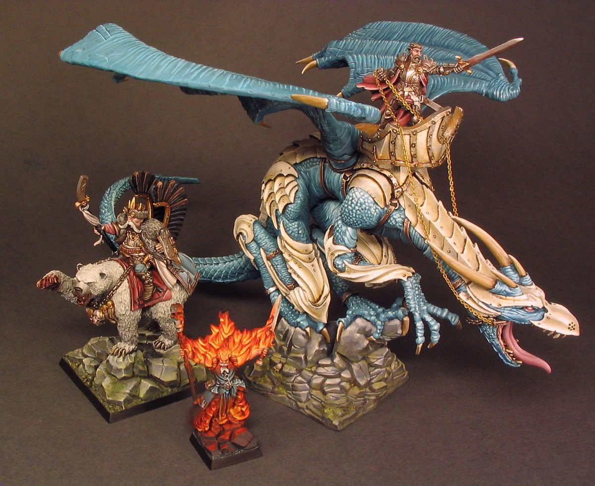
I started this project in the start of september and since then it has progressed in varying speeds. I've written before about painting the dragon when it was still in wip stage, the article can be found here. Also the Tsar Boris of Kislev on Bear and Empire Fire Wizard (both from Citadel) are part of the same commission. All these characters look very personal when compared to each other and with painting I wanted emphasize this individuality to truly bring out the core essence of the these sculpts. Of course this is just my own interperation but I hope that people enjoy viewing thse colours and shapes composed together.

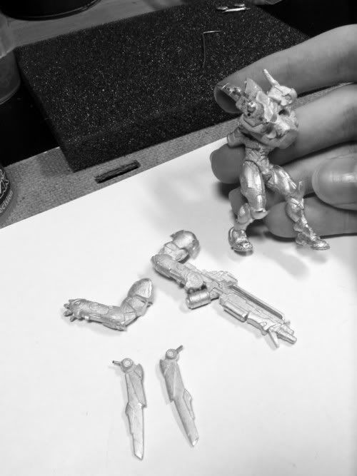
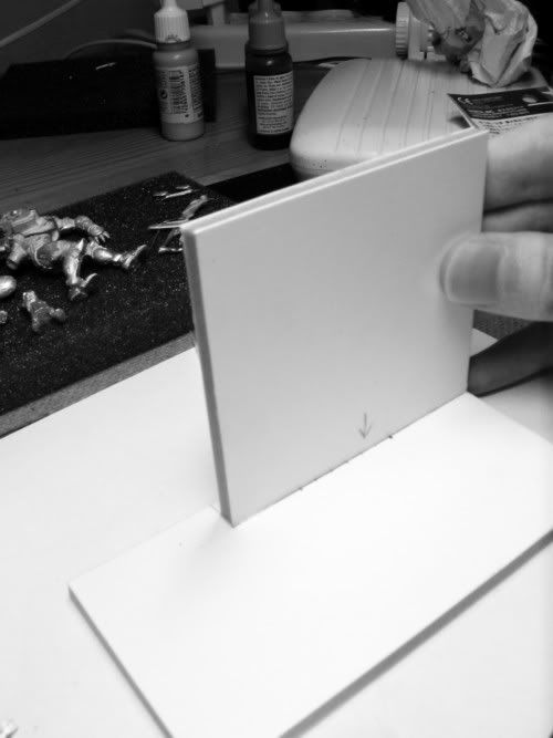
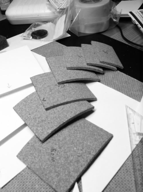
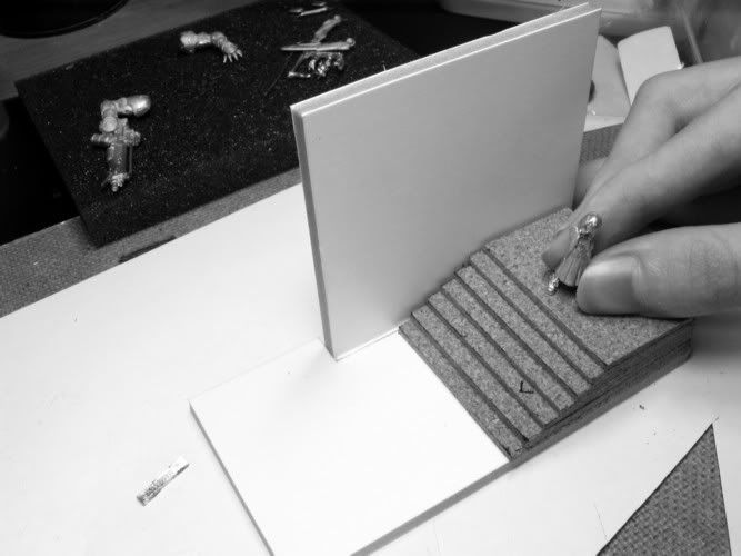
The bases on Boris and the wizard I have sculpted from Milliput. I'm fairly pleased about how they turned out knowing how hard sculpting good looking rocks can be. I made the core structure of the rocks by glueing rough pieces of 5-3mm thick corkboard to the base. Then I just slapped on first "coat" of Milliput to cover all the cork at the same time I stroke some rough shapes of the boulders with sculpting tool (with the blade type head). I think I mixed some Green stuff with the Milliput to prevent it from detaching from the cork surface so easily when sculpting because, while the cork is good material to bulk up stuff, some sculpting materials don't stick too well to it. It's not really an issue and once the putty starts to set it gets pretty unnoticeable.


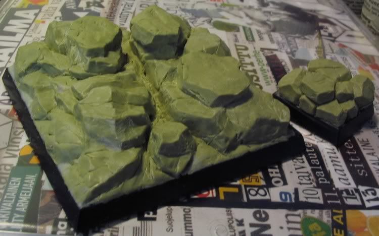
Here are pic of the sculpted bases in WIP stage. I sharpened some rocks after the putty had cured by scraping and filing the edges. Then I covered the edges of the base with magic sculp. I had already assembled the bear to see how the paws will be placed. You may notice the lightly pressed stamps of the bear paws on the highest rocks. The front left foot of the bear already has a rock under it as a part of the original sculpt and I tried to pay attention to get the point of connection look as unobtrusive as I could. Partly because of this I had to connect the base and model before painting.


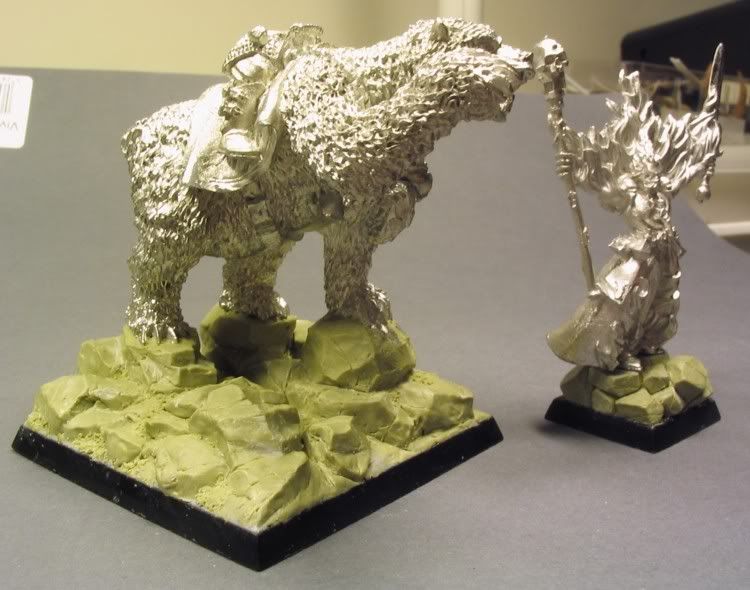
When I had the bear pinned and attached to the base I tried to sculpt seamless connection beetween the model and the base. In this stage I also sculpted some moss around the rocks it's actually placed more like some sand or gravel but still should fit the purpose. I also attached the wizard to it's base because the object source lightning from flames would affect the painting stage and it would not have been of any use to keep them separate.


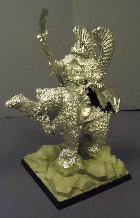
Ok, not much more to add. Finally I ended up with the whole Boris assembled before going to painting stage. I didn't want to paint the upper body separately because it needed some serious gap filling and I just undercoated the hidden area below the mantle with brush before attaching the parts. I only left the shield to be painted separately.


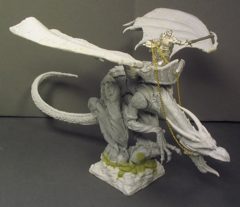
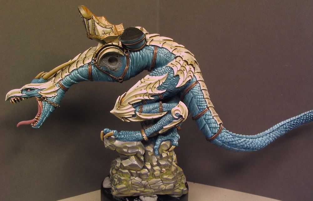
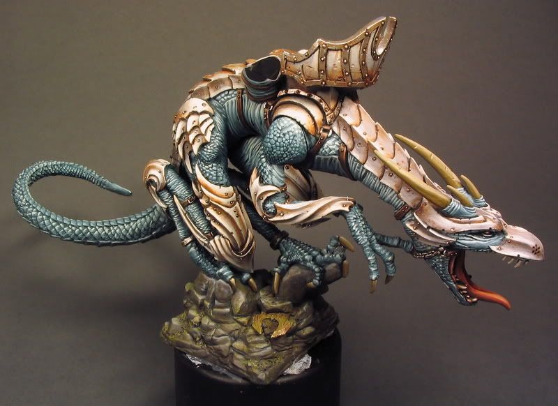
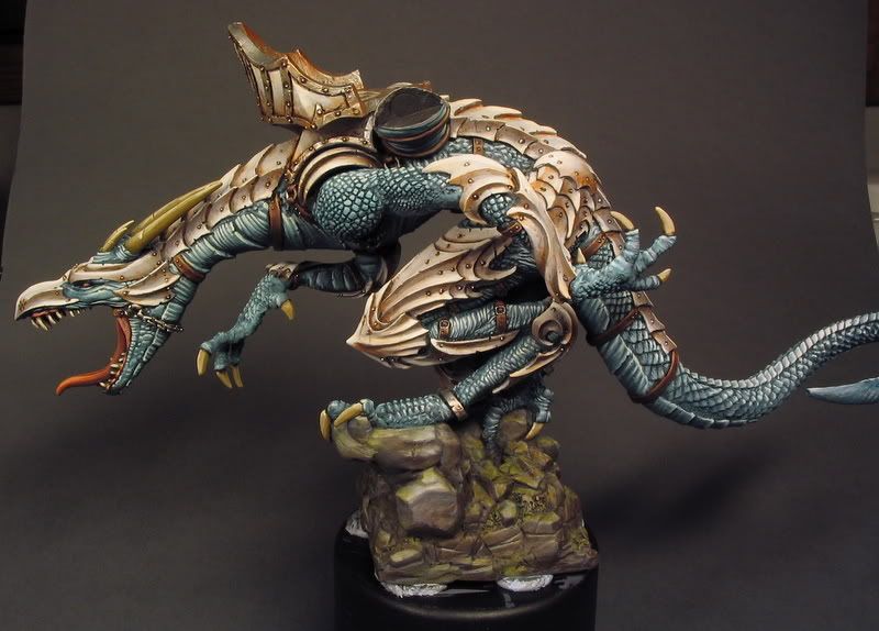
It always takes me forever to assemble and prepare minis like this. All that pinning and airbubble filling takes some serious patience (which I to often lack when preparing minis) so it took me some time. Fortunately I had build this mini once before and I am sure the experience helped me a lot this time. The arms were the only part I would attach after the painting. The wings and the rider are detachable and also painted separately. Wings have the magnets and the rider is attached with two pins (the chain is hanging from small hooks I attached to the dragon.


Then I primed the models black and then I dusted lightly some white to give the final painted colours a better reflection capacity than the plain black would allow. It's also easier to see the details and direction of light. The pic shows how the painting started. It's the colour test. I had already basecoated all the skin and armour areas before I took this pic. This is pretty much I advance; I first divide the skin areas to zones and I paint one zone at a time. Then I do the same for the armour etc. I normally paint the glazes when all the zones are layered but in the pic the leg has some glazes because I tested the colour theme to this zone.


Ok, this has been seen already. I wish I had more work in progress pics I think I often get too enchanted when I paint. The light look quite otherwordly because the camera started to live it's own life once again (you should see what it does sometimes). Maybe I should tell about the black thing that can be seen in the bottom of the pic. It's a cap of a spray bottle (surprise) it's sturdier than the ones GW sprays have and I use it to hold big miniatures. Enough blu-tac and there's no fear about the mini falling down. I rotate the minis a lot in every direction when I paint to find the optimal angles for brush strokes and it's very important that the figure is easy to handle and a good grasp prevents well any cramping and things like that. Even the Boris figure which is very hefty remained stablely attached through the whole painting stage with about eight blobs of blu-tac.


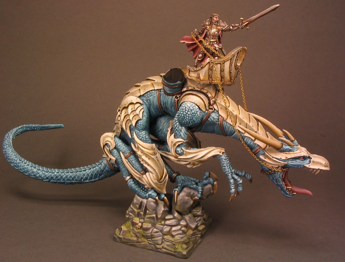
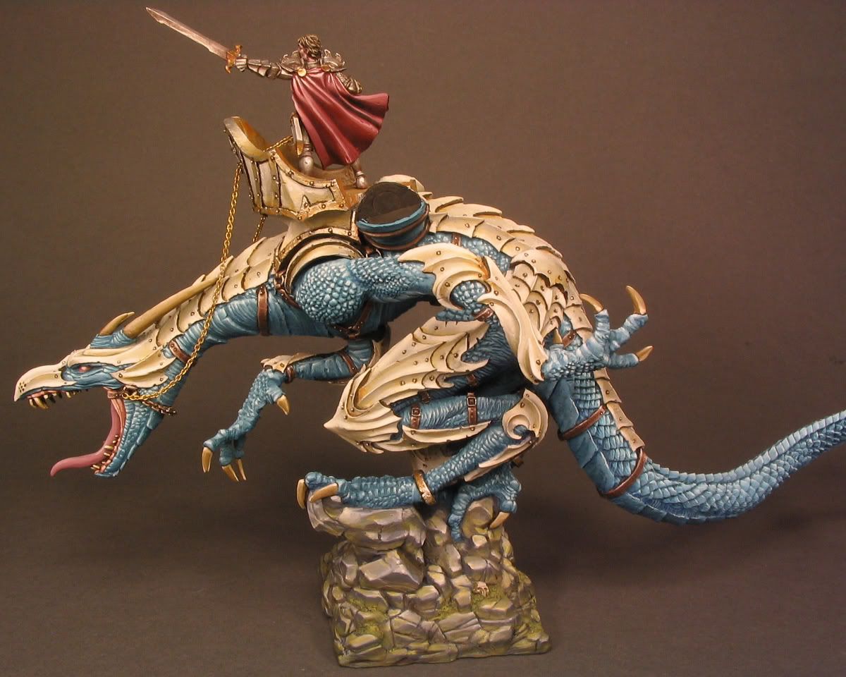
Here I have the arms painted and attached. Also the rider which is again the Götz figure from Hell Dorado range is here painted and placed in his hood (the right word?). These pics show the armour offwhites and colours better. I think the rosey red on the Gotz's cape fits the dragon colours very well and makes the rider stand out more but not too much.


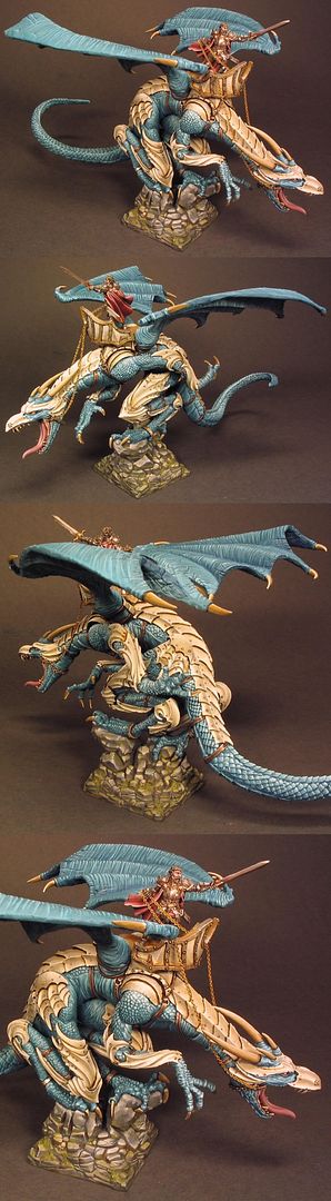
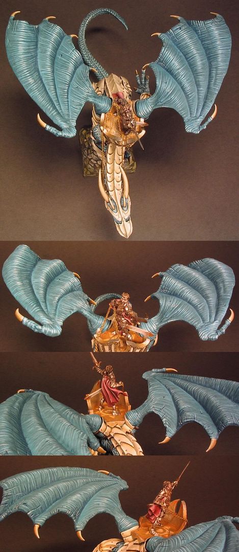
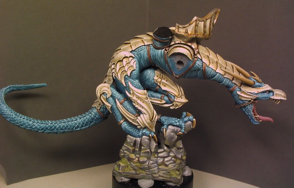
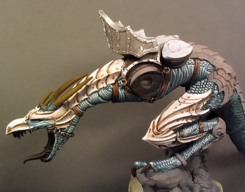
These are the final pics I took of the dragon. When I first time tried to paint those wings a year ago I had to repaint them few times because I were not happy with the result. This time painting those wrinkles and light scale were not that challenging and I think I mostly managed to give the wings the gleaming shiny effect of the reptilian skin to make them look interesting without strong tonal changes that wouldn't probably have fitted with the overall look. After layering the wrinkles I painted thin glazes of Prussian blue (mixed with some Royal purple) to shade the darker reas of the skin. If you use strictly zenithal style of highlighting on a large almost horizontal surfaces like those wings the result would possibly look a bit plain if you don't use stronger tonal changes than I did. I tried to solve this problem by giving both wings a visible secondary light source which creates the shadows on the other side of the wing curves. I also painted them as mirrors of each other because it would have looked very odd to have a shadow along the outer edge of the other wing.


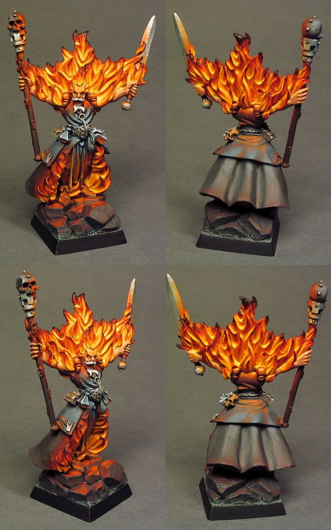
It's always hard to paint convincing flame effect. Normally you would just highlight the parts that the light naturally picks and leave the recesses shadowed. With the flames you need to paint the core bright and at the same time take care that those bright areas still reflect the natural light. I think the sculpt heavily impacts on the approach you have to take to painting artificial light sources in three dimensional form.

I first undercoated the flames evenly with the most dominant colour which is hot orange-red. I used VMC Vermillion, Bright Orange and Cadmium Umber Red to a good tone. Then I started to bouild highlight partly towards the core and partly where the real light hits on the mini. I am glad this mini's flames have those roundly sculpted recesses which reflect light well without being rised (this not very good thing in case you want deep shadows in the recesses). So I first painted towards the light first from Vermillion to Bright orange, then to Ice Yellow through Deep Yellow and I were done. I had a big LP cover to look some reference (this one) and I noted it's not necessary at all to paint the brightest spots with pure white so I didn't make the cores of the flames no lighter than Ice yellow and I think it works quite well. Then I just layered the tips of the flames through Cadm. umber red to almost pure black peaks. To emphasize the warm flames and the source lightning effect I made the other areas cold and dark almost nightly looking. The icy blue lights around the belt buckle have no actual light source but I thought it would look quite cool.


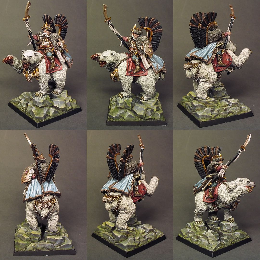
A week ago I saw Werner Herzog's document Grizzly Man about Timothy Treadwell and now this mini just makes me a bit sad, it just looked funny/silly before... Well, nevertheless I'm very happy about how the colours and painting turned out on this one. The blue and red tones are based in same colours I used on the dragon just mixed in quite different ratios to give the model a very distinct, subtle atmosphere.

I started by undercoating the bear fur and painting the base. I used the same method as I did with the dragon. First I layered the rocks in grey scale with no or little tonal changes beetween areas and then painted the green and brown tones with thin and transparent glazes to birng some life to the grey. I very much like the glazing tecnique as it reminds me of watercolour painting but I mostly enjoy toying with glazes only when I paint bases and it's better not to have too clean finish.

I had painted some layers to the bear fur when I undercoated almost all other areas of the model with black brown. I've noticed that this is a quite suitable undercoat before painting the basecoats it also provides a good base for the darklining when you cleanly block the separate areas with the basic colours and leave fine thin lines in the recesses. I've found the Black brown to be best choice for close to nature and organic subjects for sci-fi models etc. I often replace it with Dark Sea Blue but I don't use much black on models these days, mainly when I need to paint black details like the fethers and halberd shaft on this model.

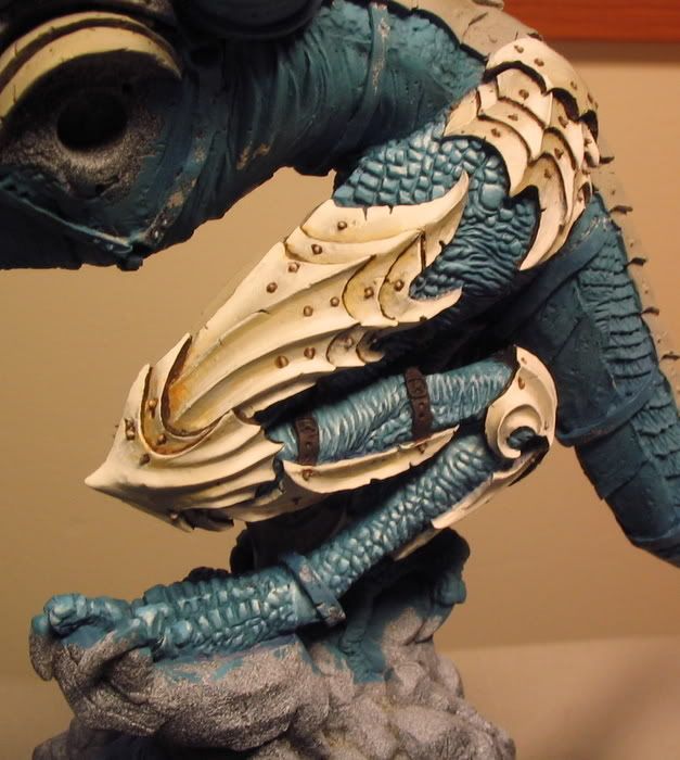
The gold parts of this model I have first painted with Mithril Silver to provide the gold paint a better coverage. The I painted couple thin layers of VMC Brass to make an even basecoat for the bling. I don't know if some people actually can recognize any major differences beetween these metallic paints especially when they are glazed and hgilighted. After having painted the covering basecoats I glazed these areas with mixes of Brown glaze and Cadm. umber red. Then I took the brass out again and painted first highlight layer with it. After this I mixed it with some Mithril silver to piant the brighter highlights. I don't go to pure Mithril Silver because the "gold" parts can blend too much with the metallic silver parts.

Thanks for everyone who took the time to go through these random musings I hope some of it makes sense. Soundtrack for it was provided by Paavoharju.

Monday, November 16, 2009

Flames beyond the cold mountain

I painted this funny mini last week, her name is Candy and the creature on her feet is her cute little sidekick Cola. This is the first release of the new miniature company Soda Pop Miniatures. They don't seem to hesitate moving straight to bigger releases it will be very interesting to see how that princess Malya concept art turns out as a model.

Friday, November 6, 2009

Deleted Scenes II

I painted these for Studio Miniatures few weeks ago. I had a great reference pic for the colours. I like very much to design personal colour schemes but it's also great fun to have a real life reference or nice concept art to imitate.

I love mixing paints to create interesting and nice tones for the fabrics. i would like to say the best colours are a result of thoughtful combination but once you know the basics spontaneous paint mixing is just as good or even better. In the case of this hospital staff I needed to use a lot of neutral colours which is easily achieved by mixing light greyish hues to too bright colours. It's a good way to first a very strong and blod colour and then mute it with small amounts of grey and/or greyish colours. Toning down can easily make the colours look dead and dull which is not a very good thing in miniature scale but if it happens it's good to have also some bold colours to create a very strong contrast which might give a very striking effect (I need to try that). In the start I figured that I won't be able to use any too bright colours if I want to capture the serene hospital atmosphere that comes from the pastels and offwhites. The one with the horribly bold yellow hospital gown in the patient set were the kind of mistake I really wanted to avoid this time. Actually the free mini that Studio Miniatures releases with the 3rd horde set I were asked to paint with very bright colours, it's a surprise bonus for buyers (I think) so no pics (yet).

When I paint these Studio Miniature sets I want the colours of a individual mini to fit in the set as a whole normally this means that I use a different variety of colour combinations in each mini and only the pale skin and grey tones in bases connect the whole mob. Colourwise I think this or the 3rd set is my best composition so far (and 4th the worst). After the first set I were given a polite advice to go for a less pastelly and bright look in the future. I of course did my best to follow this instruction and you can probably follow the darker direction and several slips from it from the pics. I know that my painting style can't be called very gloomy and grim but it doesn't seem like these zombies will give you flowers and a hug... atleast I certainly hope so :). I would love to try to create something very sombre, the Silent Hill type sombre. I've never actually played those games but I've always been very impressed by the haunting visual look of the screenshots/trailers I've seen. Ok it's been almost a year since I played something last time.. it were that sony DIY game with those big headed puppets...

What I meant to write about is that I've been practicing sculpting for a while now (not in six months *blush*). I have some pics of the stuff I've done here and one of my zombie sculpts is now available in the runners-up set of the Frothers 5th sculpting competition. I hope to get my hands on these casts soon & paint one and possibly give away some free casts for the readers of this blog like my fellow blogger Mikko did in his great blog Dawn of the Lead with his casted sculpts. Though I'm not sure how many I'll receive.


Monday, October 26, 2009

Something?

here's something...


I think I'm going to incorporate more WIP material of the stuff I'm painting. This is a part of a commission project I've been working for a quite some time now. Yes, it's another dragon from Ultraforge and YES, the scheme may look familiar but it actually differs evidently from the one I did before. This time I'm using much richer and varying blue/turqoise tones on the skin/scales and I'm painting the armour plates with subtle yellowish offwhite tones to prevent the unsuccesful NMM look that may occur if too strong contrast are being used (i.e. too dark basecoat) beetween the shadow and light.

I first cleaned an old vallejo bottle and used it to lay down a good tone for the basecoat of the skin/scales. Last time I didn't do it and I had to mix the colour again everytime I moved to paint a new part of the figure. I created the basecoat colour by mixing several blue tones from VMC range (Light turqoise, Blue green, Pastel blue, Deep sky blue, Green sky, Dark sea blue, Dark prussian blue, Oxford blue...) to the empty bottle until I were satisfied with the tone. I have no recordings for the measures of different tones in the mix and I admit that the mixture is ver close to lightened Dark sea blue with less grey and stronger blue/truqoise tone. The more important thing is what paints are added to the basecoat to mix the paint for the lighter layers. I used Deep sky blue and also small amounts of pastel blue to build up the light reflection on scales/wrinkles. It's also important to have the shadows/non-reflecting surfaces on the lightest areas painted with lighter basecoat than the deepest shadows below the limbs. When I painted the basecoat I mixed it with different amounts of Dark prussian blue (which I planned to use for glazing the darkest shadows later) and painted the first actual layers with the pure basecoat tone. When I paint the first couple layers it's important to let the paint flow to the recesses of scales and wrinkles in the areas where the last brightest layers will be located. It's kind of sketchy layering phase with no need pay great amount of attention to the surface texture & details. When I start to add Offwhite to the mix (when it's almost pure Deep sky blue) I am already paying a lot of attention to the brush control and detailed painting, it's kind of stp by step process and the last dots of almost pure Offwhite I stipple with my best (and only) detail brush (which is currently W&N series 7 miniature size 2). In the pics you can see how the gleam of the scales looks more convincing in some parts than it does in others... this happens when the tonal change beetween semi light and lightest tones is not fast enough or the semi light areas are too big It's very challenging to execute perfectly as you have to always estimate the optimal size and lightness & location of the layers from start to finish.. the smoothness beetween layers is also important but not the main target for me.

I used two colours to mix the basecoat for the armour; VMC Light grey and Orange ochre. This time the mix is simple and the measures are pointless just not too yellow and not too grey that's how I see it. When I have layered the armour to pure white I paint thin glazes of Orange ochre to the shadow areas mainly. My attitude towards darklining changes repeatedly and it heavily depends on the case I often think that the contrast beetween colours & natural shadows (and perhaps light darklining..) are enough to stay away from this unintentionally comical (in a bad way) technique. In this case the thin dark lining separating the armour plates and rivets is necessary to achieve the right look and to enhance the power of the subtle colours used on the armour surfaces. I paint some of the lining before the layering just to lessen the percentual possibility of screwing up. I use thinned mixes of VMC Dark brown and Brown glaze for this lining I change the measures depending on how dark the lining need to be, for example I found that the best looking way to line out the rivets is to have more Brown glaze in the mix because too strong contrast in little detail points like those can look odd on a light surface.

Sorry for all the bad English grammar etc. got a spare hour for a little write-up... weird :)

..and the pics (the white parts are a bit over-exposured)


Here are some work in progress pics of the one I painted a year ago.

Tuesday, October 13, 2009

Tervetuloa mutanttimaahan!

This is Nuclear Jones a new Hero from Pulp City, the miniature is once again a stunning piece of sculpture by James Van Schaik.