
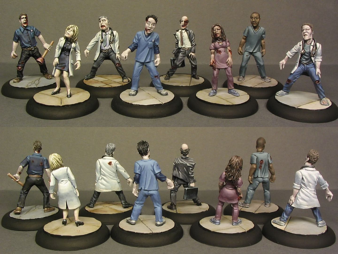
I love mixing paints to create interesting and nice tones for the fabrics. i would like to say the best colours are a result of thoughtful combination but once you know the basics spontaneous paint mixing is just as good or even better. In the case of this hospital staff I needed to use a lot of neutral colours which is easily achieved by mixing light greyish hues to too bright colours. It's a good way to first a very strong and blod colour and then mute it with small amounts of grey and/or greyish colours. Toning down can easily make the colours look dead and dull which is not a very good thing in miniature scale but if it happens it's good to have also some bold colours to create a very strong contrast which might give a very striking effect (I need to try that). In the start I figured that I won't be able to use any too bright colours if I want to capture the serene hospital atmosphere that comes from the pastels and offwhites. The one with the horribly bold yellow hospital gown in the patient set were the kind of mistake I really wanted to avoid this time. Actually the free mini that Studio Miniatures releases with the 3rd horde set I were asked to paint with very bright colours, it's a surprise bonus for buyers (I think) so no pics (yet).
When I paint these Studio Miniature sets I want the colours of a individual mini to fit in the set as a whole normally this means that I use a different variety of colour combinations in each mini and only the pale skin and grey tones in bases connect the whole mob. Colourwise I think this or the 3rd set is my best composition so far (and 4th the worst). After the first set I were given a polite advice to go for a less pastelly and bright look in the future. I of course did my best to follow this instruction and you can probably follow the darker direction and several slips from it from the pics. I know that my painting style can't be called very gloomy and grim but it doesn't seem like these zombies will give you flowers and a hug... atleast I certainly hope so :). I would love to try to create something very sombre, the Silent Hill type sombre. I've never actually played those games but I've always been very impressed by the haunting visual look of the screenshots/trailers I've seen. Ok it's been almost a year since I played something last time.. it were that sony DIY game with those big headed puppets...
What I meant to write about is that I've been practicing sculpting for a while now (not in six months *blush*). I have some pics of the stuff I've done here and one of my zombie sculpts is now available in the runners-up set of the Frothers 5th sculpting competition. I hope to get my hands on these casts soon & paint one and possibly give away some free casts for the readers of this blog like my fellow blogger Mikko did in his great blog Dawn of the Lead with his casted sculpts. Though I'm not sure how many I'll receive.
3 comments:
These are really cool minis with great paint jobs. Again! I look forward to seeing your very own zombies painted by yourself.
Excellent job! I really like your painting style. Very life-like shadows.
Getting a topaz ring as links london jewellery jewelry gifts from better-half is no lower than an awesome joy. discount links of london bracelets Many ladies do admire such jewelry sparkling through charms links of london their fingers. If you may get to own one as gift, links of london silver watches you will definitely appreciate such beauty and elegance for high class cheap links of london necklaces type of jewelry. Those who know what the actual worth of gemstones will links london pendants certainly love to have one added into their collection.
Post a Comment